New in Data Studio: Add @googlemaps to your reports and let viewers see your data in a whole new geographic dimension.
— Google Analytics (@googleanalytics) May 1, 2020
Google Maps in Data Studio are interactive and integrate with any data source that contains valid geo fields. https://t.co/UXlfedkjyV #measure pic.twitter.com/9kLvYjFhzl
Data Studio, data studio, data studio… such a great tool - but always missing that last little bit. There's been lots of great visualizations made with data studio but when you've wanted to push it just that little bit further - you've been presented with the limitations of a “free” tool. Want some extra complicated functions or metrics? Data studio has a lot - just not as many as a paid for competitor like Tableau or Power BI.
Data Studio only has limited text functions. Want everything in UPPER case? No problem. PROPER case… er sorry we don't have that - you'll have to fix your data somewhere else (eg BigQuery) first. Sure that's not “massive” issue - but there's always that small thing that makes it clear that data studio, great as it is, has not been “finished” to the degree of a paid for tool.
One of the most famous bugbears has been the mapping of course. In previous versions of Data Studio, Map zooms were limited to country level outside of the United States. The map of Australia is/was very frustrating… why does it always include New Zealand? The New Zealand one is not too bad I guess… I notice it still includes a bit of “the big island” though.
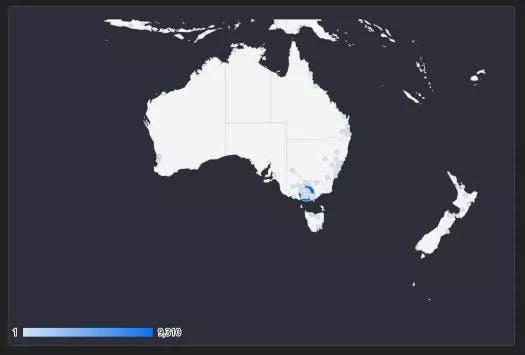
Australia... plus the extra bits you dont want in old school data studio maps
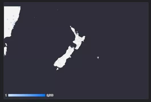
New Zealand looks ok... but it still includes a bit of “the big island”
The big problems here are:
- No zoom control either by the user in view mode OR by the creator in edit mode. Youre stuck with the image above always
- Only Country view similar to above. If you want to zoom into state or city or even smaller level, you cant. For a massive country like Australia this is a big problem. Cities like Sydney and Melbourne swallow up all the satellite towns around them into one big blob
- No finer controls Wanna change bubble size? Or colour for different metrics… Nope - your stuck with the standard views above…
…until now!
First look at Google Maps in Data Studio
So Google has added Google Maps as a chart type in Data Studio!!!
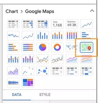
Heh.. I see your eyebrows raised. Yes that same ubiquitous Google maps is now a chart option in Data Studio. So all the bells and whistles of Google Maps are there too… what does this actually mean??? *Excited expression
It means:
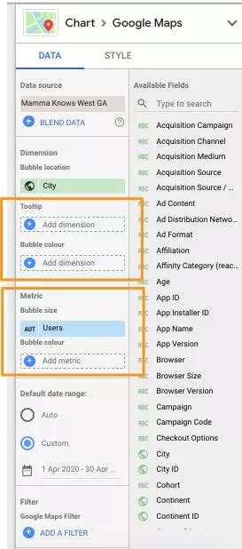
1) Google Maps is a Chart Option in Data Studio
Tool Tip and Bubble Size/Colour are the highlights of the new chart type data options. Bubble size allows you to assign different metrics for size and colour - GREAT! This way you can compare things like users v profitability per user... :-) Tool tip is a nice addition where end users can see actual metric and dimension values by hovering over data points on the map. You have fine grain control over what is displayed
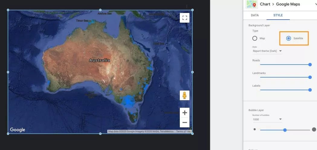
2) You can now change maps to be in Satellite view
The image below shows Australia in all its red/brown glory.
3) There are further fine grained controls on what is shown in maps
The images below show Sydney Harbour, Google Maps style in Data Studio
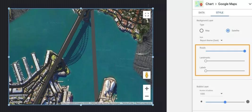
Sydney Harbour with "Roads" Highlighted
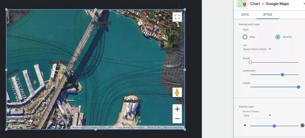
Sydney Harbour with "Labels" and "Landmarks" Highlighted
4) Addresses are a new data type in Data Studio amazing!
There is a new address data type in Data Studio. See below.
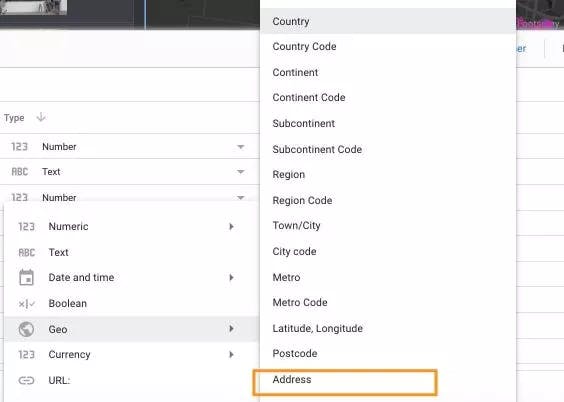
Address data types
In our experience this field is phenomenal - but its only as good as the data you throw at it. If you put in say “Newport” as your address, it seems to generally default to the USA version of “Newport”. See Scott’s post on the official Google Analytics Twitter account here:
Note: Town/City doesnt work properly in Adwords (example source in link). Eg see image - it reports "Brisbane" as being in California. Even filtering by country doesnt work. You need to create a new field (I did concat(ctry,region,city)) and make it and "Address type" :-) pic.twitter.com/leS2X3w1NG
— Scott Sunderland (@ScottSunderl4nd) May 2, 2020
The above was in reference to an Adwords account that was targeting Australian users only. The mapping tool in Data studio for this connector fails to realise which version of a “Town/City” you are referring too. For example, if you're adwords campaign is targeting only Australia - Google Maps still doesnt know where "Newport" is. You need to specify which country and city you mean.
This is easily fixed though. Like above, by creating a calculated field that concatenates something to define which city/country you are talking about. Above we concatenated “," + "Australia” and this fixed the problem.
Playing Around With Google Maps in Data Studio
We had a few hours to throw together some things in Data Studio with the new google maps functionality. And this is what we came up with
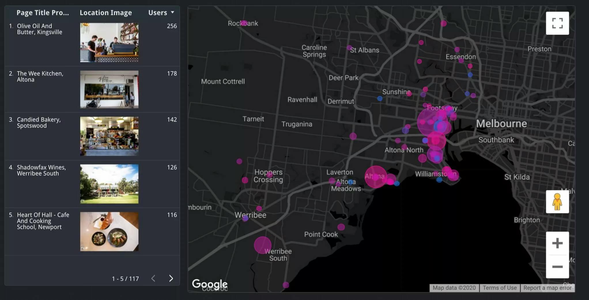
First up the integration needs help in finding incomplete addresses. See below. This is a view of data linked straight to the Google Analytics datasource. The “addresses” in this case are in fact page titles for a review website. They include the place name and suburb e.g. Olive Oil And Butter, Kingsville (a suburb of Melbourne). When applying this combination in Data Studio, Google Maps will default to the Suburb level - in this case Kingsville. Now that’s pretty great still… See the visualisation below. But it’s not going to find the “actual address” for you which would be much nicer than "lumping" them all in to the same suburb...
To do that your gonna need some help…
Google Maps needs help guessing some places/landmarks
Geocoding API anyone??? Or Places API perhaps??
Surely there’s a quick way to convert these pesky “half addresses”? Mannnn… this is the Big G we are talking about. (Or the big S… Stackexhange, whichever you prefer!). A few taps and clicks got us to here
This is the code we used:
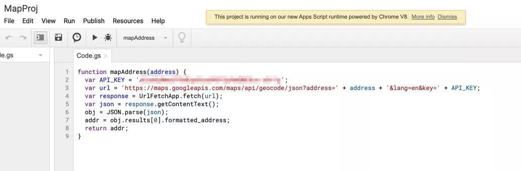
Address data types
function mapAddress(address) { var API_KEY = 'yourapikeyhere'; var url = 'https://maps.googleapis.com/maps/api/geocode/json?address=' + address + '&lang=en&key=' + API_KEY; var response = UrlFetchApp.fetch(url); var json = response.getContentText(); obj = JSON.parse(json); addr = obj.results[0].formatted_address; return addr; }
Thanks Bastians https://stackoverflow.com/users/4382309/bastians
How to use the Google Places or Google Geocoding API
How do you set this up? Pretty simple.
- Create a new project in Google Cloud Console (which has billing allowed) This is easy.
- Enable the API you want (in our case the Geocoding API). See below
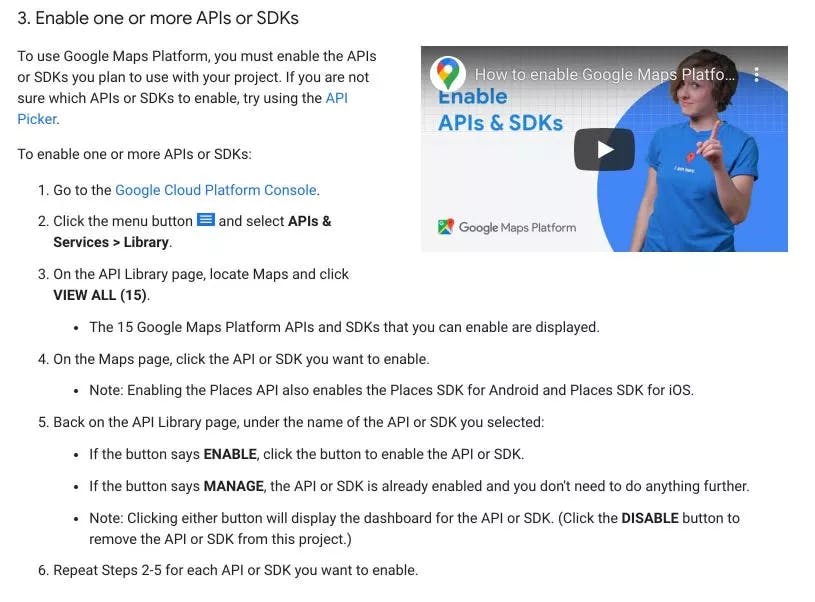
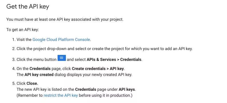
- Get an API Key. Follow these steps:
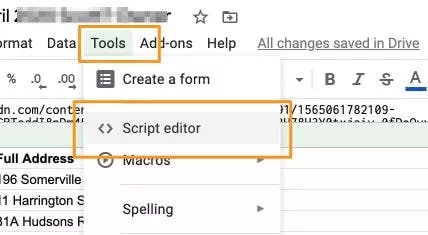
- Add to your script in Apps Script. Theres various ways to do this. We created a contained (ie lives in the google sheet) apps script through Google sheets.
Adding images to Tables in Data Studio
So in order to get the addresses right we had to go to google sheets as an intermediary step. Ok then.. While we are there why don't we take advantage of another (older but still cool) feature of data studio? The IMAGE function. Quick search… and our friends at ClickInsight remind us how:
https://www.clickinsight.ca/blog/adding-images-to-your-tables-data-studio
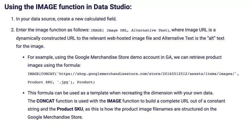
How to use the IMAGE function
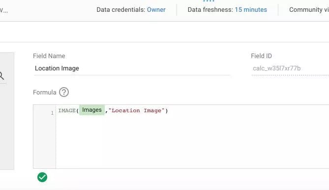
And how we deployed this in Data Studio... easy as you can see!
Final results!
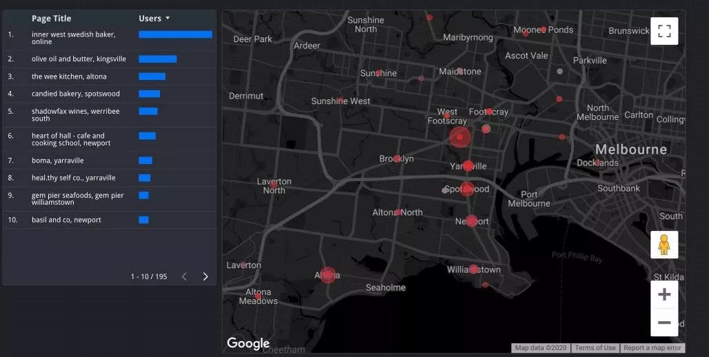
In the visualization below we are looking at various reviewed locations around western melbourne. Bubble size is the number of users for each page. Colour is determined by Avg. Pages / Session which we are using to measure engagement.
Seems pretty clear below that the frequently visited pages may lower engagement than the less frequently visited pages. Maybe these high traffic pages had campaigns or something running?
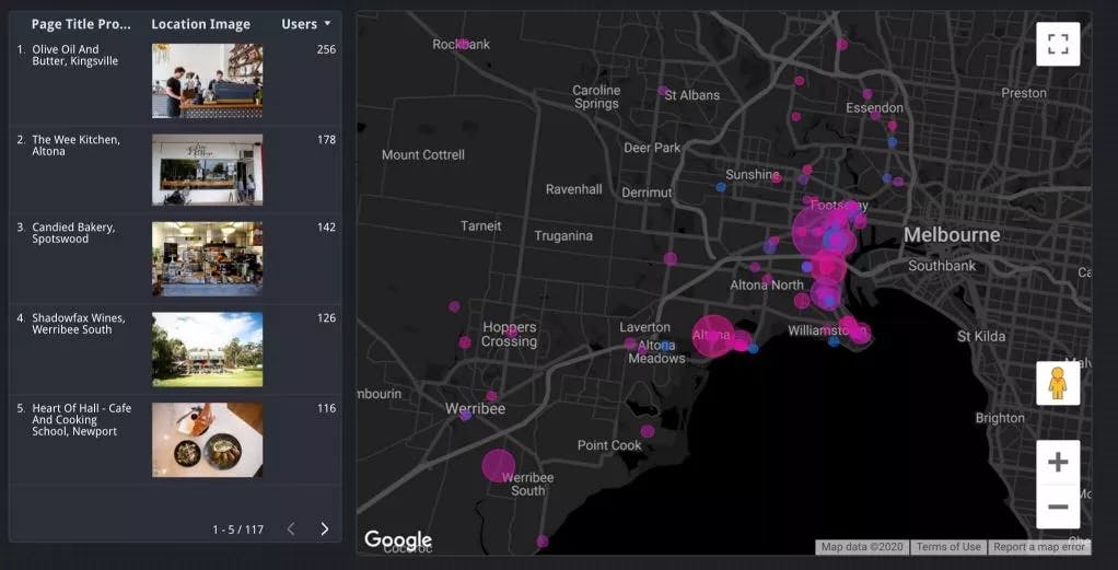
We include a table graph with images inserted using the IMAGE function as described above
From here there is no limit really. Get ready for some super awesome dashboards from everyone around the world (and us of course too!) over the coming few weeks and months. Thanks for reading!
--------------
Check out more about the awesome Data Studio Services we offer!

Scott Sunderland
We're in a pandemic... a pandemic of busy-ness! As a society we appreciate quality work